
My portfolio site asks you to take a logic test before it’ll show you a motion-design case study. The case study itself is framed as a Vulcan Science Academy archive entry. The 404 is a logical impossibility couched in IDIC terms. The cookie banner reads like a Starfleet regulation about informed consent across personnel decks.
It is, ostensibly, a fan site.
It is also a portfolio.
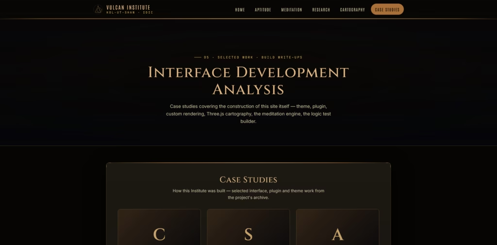
The disguise isn’t deception. The site genuinely is a fan project – the Vulcan voice runs through every micro-element, the design discipline is in service of the bit, and at no point does anything wink at the camera and say ‘don’t worry, it’s actually a portfolio’. But every page is doing portfolio work in its other hand. That’s the whole trick.
I’d had the domain for ages. vulcan.institute is exactly the kind of name that gets claimed by someone the moment you look away, and I claimed it early on the grounds that I’d ‘definitely do something with it’. Then it sat on Bluesky as a placeholder for the better part of a year. Goes nowhere, does nothing, as a wise man almost said.
December was when I finally got around to building the actual thing.
The build is a custom WordPress theme called vulcan-interface, with Elementor Pro and ACF Pro doing the heavy lifting on page construction. LCARS-inspired but specifically Vulcan-flavoured – more restrained than a Starfleet bridge, less colour, more grid. The kind of interface that looks like it was designed by people who consider aesthetics a controlled vice.
Five pages, each one doing two jobs at once.
The Vulcan Aptitude Evaluation is, on the surface, a logic puzzle framed as a Vulcan entrance exam. Underneath, it’s interactive design and front-end engineering – a working demonstration that I can build something with state, timing, and consequence. The Kol-Ut-Shan Research Archive is a set of fictitious academic abstracts in the voice of Vulcan researchers across different disciplines. It’s also writing work, in a register most copywriting doesn’t get to flex. Tight, precise, capable of holding tone across a couple of thousand words without slipping.

The Real-Time Star Map is Three.js, navigable, and actually shows star positions. Sit with it long enough and you realise it’s the kind of piece you could commission a version of for a science museum or a planetarium exhibit. The Vulcan Meditation Experience is procedural audio – a soundscape generator with voiced guidance underneath, proving I can think about sound as a design surface and not just decoration.
And then the Motion-Design Case Study, which is the explicit portfolio piece. It’s framed as an archive entry from the Vulcan Science Academy’s Department of Visual Communication, because if you’ve committed to the bit, you don’t break the bit for the one page where you actually need to look serious. The case study is real. The frame is real. They’re doing different things in the same sentence.
The thing most portfolio sites have in common is that they have nothing in common. Hero section with the designer’s name in a generous sans-serif. Brief about-me in friendly first person. Three case studies in horizontal scroll. Contact form at the bottom. A tasteful gradient somewhere. Done.
This is fine. It’s also a uniform.
vulcan.institute doesn’t look like that. It looks like a fan site that an obsessive person built for the love of it. The trick is that everything an obsessive fan site does – the consistent voice, the demonstrated specialist knowledge, the obvious point of view, the willingness to commit to a register and hold it – is also what a portfolio should do, and most of them don’t. The ‘show, don’t tell’ principle eats portfolios for breakfast. A site that wears the portfolio uniform is telling you it’s a portfolio. A site that refuses to wear it is showing you what its designer thinks design is for.
I’m not claiming this is a generalisable strategy. It only works because I genuinely am the kind of person who would build a Vulcan-themed portfolio site, and the sincerity is what carries it. If you faked the fan-site framing because you’d read a Medium post about ‘standing out in a crowded market’, it would die on the page. The disguise has to be earnest, or there’s no disguise at all.
What I like most, looking at it now, is the discipline of the small things. The error states. The form-field placeholder text. The breadcrumbs. The little ‘Logic Verified’ tick that appears after the aptitude test. The cookie banner that reads like a Starfleet directive, because of course it does. Nobody is reading those things and grading me on them, but the site only works if I held the voice across all of them. The bits no one sees are the bits that prove the bits everyone sees aren’t an accident.
The site went live on shared hosting. It’ll move later, to AXIOM via the AUTO mirror and the deploy relay the homelab has been quietly running for a while, but in December it’s just sitting on its first server, being a thing.
A portfolio. A fan site. A logical impossibility that resolves itself the moment you notice it isn’t trying to hide.
Surak would, I think, be unmoved. Which is roughly the response the site is designed to earn.