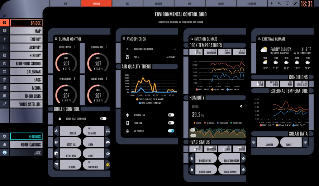
The bedroom TRV is reading 17.4 degrees, the boiler is idle, and the panel telling me this is laid out like an Engineering subsystems readout off the Enterprise-D. Six months on, I am still pleased about it.
The base of this is HA-LCARS, th3jesta’s theme. It does the heavy lifting on colour, typography, the orange/peach/lavender palette, the rounded asymmetric corners, the right font. Install it through HACS, point your dashboard theme at it, and you immediately have something that looks like LCARS. Which is where most people stop.
That’s the trap. LCARS-the-aesthetic is colour blocks and rounded corners. LCARS-the-interface is something else. It’s a spatial language. Information clusters by function. Navigation sits in framed bars at the edges where Picard’s thumb would land. Primary actions get given the chunky orange button. Status rows are dense because Starfleet has somewhere to be. Most LCARS skins give you the colours and call it done, and you end up with a perfectly normal Home Assistant dashboard wearing a Starfleet uniform. Which is fine. It is not the same thing.
Getting from one to the other meant a lot of card-mod. Per-card class names so the theme could pick out specific panels and give them the right framing. Vertical stacks pretending to be flush LCARS sections, with conditional cards underneath so things only appear when they have something to say. Spacer rows where LCARS would have a black gutter, because the visual rhythm matters more than the inch of vertical I saved without it. Home Assistant’s dashboard YAML is doing more than Home Assistant’s dashboard YAML was probably built for. It mostly puts up with it.
The bits that work, work well.
The heating panel is the newest of the lot and already the one I look at most. Four TRVZBs, four standalone Sonoff sensors paired up for weighted readings, the boiler state down the bottom. Laid out as a strip of subsystem rows with the room name on the left in proper LCARS framing, current temperature and setpoint side by side, valve position on the right. It reads like a status board, not a wall of cards. At a glance I can see which rooms are calling and what the boiler is doing about it. The same information in a default Lovelace layout used to take me three or four seconds to parse. Now it doesn’t.
The voice satellite row is the same idea, smaller. COMM-01 and COMM-02 along the top, their conversation states colour-coded into the LCARS palette, listening, processing, idle. It looks like a comms panel on the bridge because functionally that is what it is, two voice satellites and a status indicator for each one. The frame did the work of saying what the row was for without needing a label.
The energy panel I am less precious about, but it survived. Octopus Mini feed on the left, current draw, today’s total. Nothing clever, but the dense LCARS framing makes the numbers easier to scan than the default energy dashboard, which always feels like it’s been designed for a quarterly report rather than a glance.
What didn’t survive contact with daily use is more interesting than what did.
I had a beautiful radial nav at one point, the main dashboard sections arrayed around a central LCARS-style hub. It looked tremendous in screenshots. Then I tried to actually use it on my phone in the kitchen with one wet hand, trying to turn the kitchen light on, and the lovely radial hub made the light toggle two taps further away than it used to be. The radial nav lasted about a week. There is a flat row of buttons in its place now, in the right palette, in the right corner, doing the job.
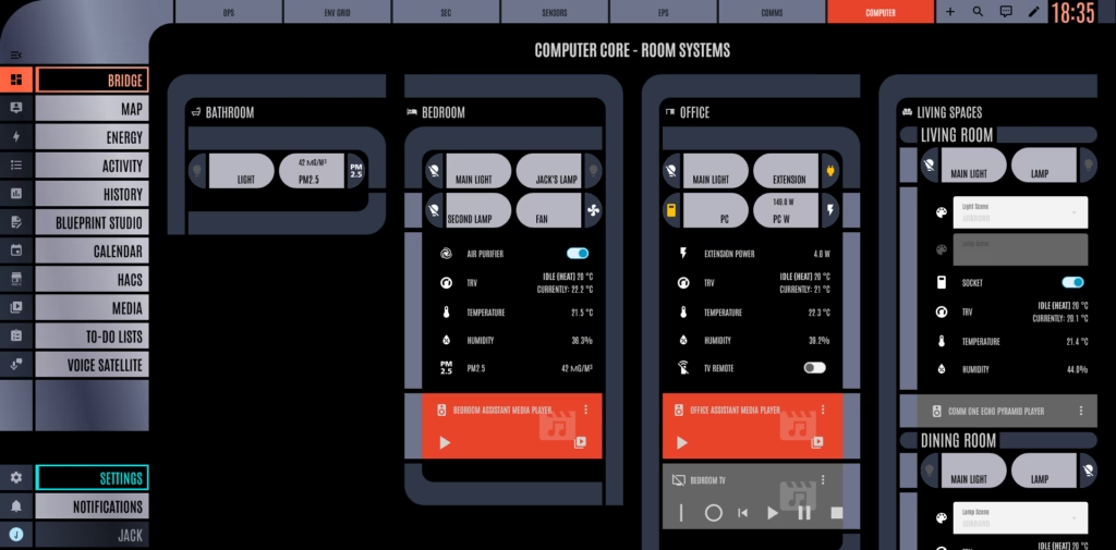
A few panels got too dense. A ‘Bridge Overview’ page that crammed every important sensor onto one screen looked like a Galaxy-class master systems display and felt like one to operate, in the bad sense. I broke it back into separate views. LCARS on the show does not actually try to put everything on one panel either, which I should have noticed before I tried to.
The lesson is the obvious one. The aesthetic has to bend to the interface, not the other way round. LCARS earns its place when it makes information easier to scan or actions easier to reach. Where it doesn’t, the aesthetic loses, every time. The dashboard that survives is the one I would still use if it looked like a normal Lovelace page. LCARS is just the thing it happens to be wearing.
Which is, in the end, the point. The job gets done either way. The heating still comes on. The lights still turn off. The Octopus Mini still reports its numbers regardless of which font is wrapped around them.
LCARS just makes me happier to look at the thing while I do it. After six months, that has not worn off. I don’t see it wearing off any time soon.