The brief from was a programme for the VE Day production. Songs, scenes, cast list, the usual. A theatre programme. Twenty-odd pages of names and a couple of adverts, fold in half, staple twice, done.
I made a newspaper instead.
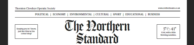
Specifically the front and inside pages of a fictional regional broadsheet called The Northern Standard, dated 7 May 1945, reporting on a victory concert at a venue that didn’t exist hosted by a town that mostly did. The cast bios became a ‘Local Faces of the Production’ column. The musical numbers became a running order printed as a ‘Tonight’s Wireless’ schedule. The director’s note ran as a leader column under a masthead I’d drawn the night before in Affinity.
It took about four times as long as a normal programme would have. Worth every minute.
The thing about period design is that it lives or dies on a handful of decisions you make before you’ve drawn a single line. Column widths. Headline weight. The exact dirty grey of newsprint that isn’t quite white and isn’t quite beige. Whether the photographs are halftones or flat blocks. Whether the leading is tight enough to feel like 1940s typesetting or loose enough to be readable by people whose eyes are now twenty or thirty or forty years older than the eyes the paper was originally designed for.
I went tight. Too tight, probably, by modern standards. But the moment you loosen it, the spell breaks and it just looks like a normal programme with a sepia filter.
The masthead was the bit I obsessed over. I drew about fifteen versions before settling. Heavy slab serif, slightly condensed, with a hairline rule above and below. The kind of masthead that says ‘this paper has existed for sixty years and will exist for sixty more’, even though it had existed for about three hours by that point. I gave it a fake establishment date of 1887 and a fake price in old money. Twopence. Nobody noticed except the one person I wanted to notice, which is the correct ratio for that sort of detail.
The photographs were the harder problem. Modern photos look modern even when you desaturate them, because the lighting is wrong and the lenses are wrong and the depth of field is wrong. I ended up running everything through a halftone effect heavy enough that you could see the dots, then nudging the contrast until the highlights went chalky. By the end most of the cast shots looked less like actors and more like trade unionists posing reluctantly outside a town hall, which was exactly what I wanted.
The bit I’m proudest of is the small ads down the side of page three. I wrote about fifteen of them. A grocer with a limited selection of dried goods. A barber on the high street offering shaves at a wartime rate. A lost dog answering to a name I’d pinched off a Cabin Pressure repeat. A funeral director with a tasteful four-line notice. None of them are real, all of them feel real, and at least two parents at the production took photos of that page specifically and texted Dan about it. That’s the metric.
The thing nobody warns you about with this kind of work is the legibility tax. You can make something feel completely authentic to a period and end up with a document nobody can actually read. The fix is to cheat – and to cheat consistently. I bumped the body text up two points from where it would have realistically sat. I widened the leading by a tiny amount. I cleaned up the worst of the halftone noise on the photos that had names attached. None of it broke the illusion because the illusion was carrying everything else.
The brochure went out. It got read. A couple of the older cast members in the production, who’d actually been around for the original VE Day as small children, told Dan it gave them a moment they hadn’t expected to have. Which is, I think, the whole point of doing this sort of thing instead of just printing twenty pages with a coloured border and calling it a programme.
The fake newspaper treatment has since shown up in three other shows. It’s becoming a house style by accident, which is the best way for a house style to happen. The next one is for something set later in the century and will need a tabloid grammar rather than a broadsheet one, which is its own set of problems for another day.
I still have the InDesign file. I open it occasionally to look at the masthead.