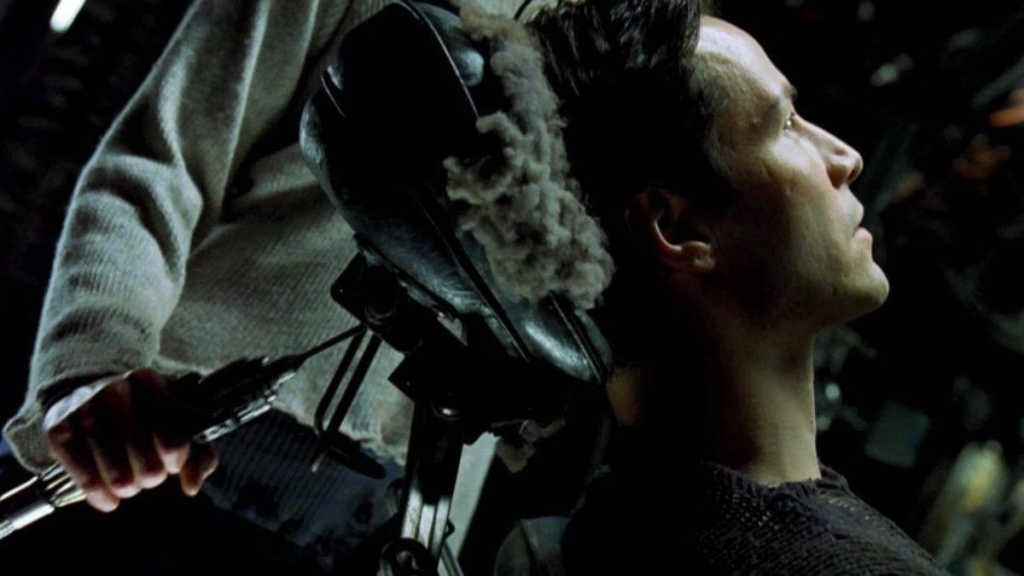
The visual I keep coming back to isn’t the bullet time. It isn’t even the rooftop chase. It’s the tech – specifically the neck-jack – the cold metal port at the base of Neo’s skull, the cable going in with a click, the room collapsing into code and then resolving into somewhere else entirely. Clinical, slightly cold, the whole apparatus suggesting that you were about to be somewhere you weren’t a second ago.
I was probably ten when I first saw that, on one of the Friday movie nights my dad ran through most of my childhood. Whatever taste for cinema I’ve got, that’s where it came from. What I took away from The Matrix at that age wasn’t really the philosophy. It was the room. The idea that you could step into a tech environment and have the room itself be the interface. Walls, surfaces, the air around you, all of it doing work.
The fantasy that grew out of it wasn’t subtle. I wanted my own version. A VR environment with unlimited space to learn and build in, where the architecture was the toolkit. The kind of thing nine-year-olds invent and forty-year-olds quietly still want.
The Matrix Reloaded landed three years later and added a refinement I hadn’t known I was waiting for: the Zion control room. The wide shots where the operators sit at consoles built from inverted dark-on-light schematics, surrounded by HUD elements that read as blueprints rather than terminals.
No glow. No neon. Lines and labels. The interface of a working city, designed for people who needed to see what was actually happening, not for a colourist looking for a hero shot.
That’s the spot I’ve been circling back to ever since, in everything from distopian UIs to the LCARS dashboards I keep building into Home Assistant. Some of it is the aesthetic. Most of it is the residue of that childhood thing – the room as the interface, the architecture as the toolkit. Maybe the all knowing oracle here an there (*cough* AI)
Worth saying out loud while we’re here: I also like brutalism, which is meant to be a controversial position. Zion is brutalist.
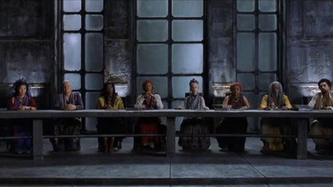
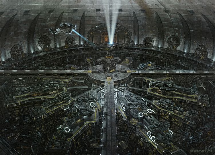
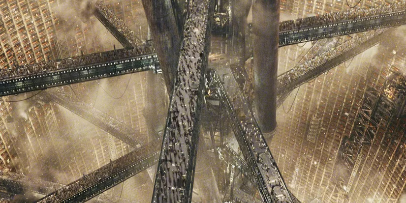
Rough concrete, exposed structural ribs, everything load-bearing. There’s something about a structure that doesn’t apologise for what it is, that just shows you its load paths and lets you get on with it. Translate that into linework on a page and you’ve got most of the rules I held to on the redesign.
gndn.me has been mine since October 2022. For three and a half years its homepage told visitors it was ‘your universal destination for bespoke Custom Web Design, tailored to both businesses and individuals.’ Green monospace (CRT style effects) on near-black, circuit-board logo above the fold, generic copy I’d have refused to ship for a client. Goes Nowhere, Does Nothing. The joke was accidental, which is the worst version of any joke.
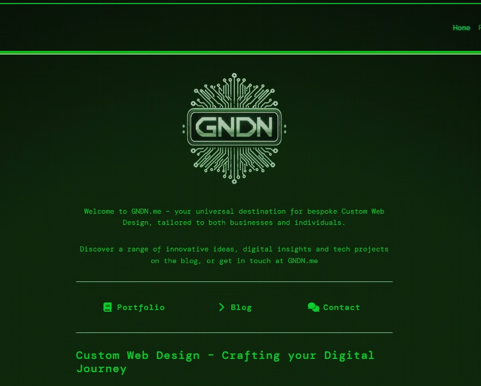
The placeholder was meant to last a month or two. It lasted three and a half years because I couldn’t bring myself to commit to what the site should actually feel like. Plenty of half-thoughts and false starts. None of them survived contact with the question of why I was building it at all.
What changed was permission to build it for me. Not as a portfolio – the site already hosts plenty of project work, and the point of the rebuild wasn’t to dress that up better. Not as a marketing instrument. As a room. Specifically, that room. The one I’ve been carrying around since I was ten.
So the new design is black linework on near-white, with a dark mode that flips to near-white on black. No glow, no neon, no chrome, no gradients, no skeuomorphism. A radar ring at the centre, sine waves and dot grids in the corners, a radial menu wrapped around the hero rather than links sat in a top bar. Bar charts and dot fills that animate in via IntersectionObserver as you scroll into them. Light 3D background elements for depth, because the Zion shots had that HUD-as-environment quality and I wanted some of it. Subtle. If you have to ask whether the 3D is too much, it already is.
Stacking vertically on mobile because there are some hills I’m not prepared to die on.
No monetary anything. No prices, no service tiers, no ‘let’s work together’ button. The site shouldn’t read as an invitation into a sales funnel. It should read as something you’ve stumbled across.
It lives on dev for now, sitting on AUTO, with the old green placeholder still public until the new build is properly through testing. The deploy chain to AXIOM goes through a OneDrive relay because my two servers don’t talk to each other directly. That’s a hard rule, established when I migrated vulcan.institute the same way earlier.
The thing I keep almost forgetting to say is that the redesign is, in the most literal sense, the closest I’ve let myself get to building the room. Not the VR fantasy version. A flat, browser-shaped version, sitting on a domain that’s been mine for three and a half years and doing nothing with the time. But the visual logic is the same, and the residue is the same, and on the right monitor in the right light I can almost squint at it and see the operator’s chair.
Nobody ordered any of it. That’s mostly the point.